The UX of Home Remodeling ( And Why Dioramas Aren’t Just for Kids)

Remodeling your home is all about decision making. Do you want a single or double vanity sink? Which light fixture do you want in the foyer? Where do you want the light socket? The sheer number of decisions is overwhelming. So, how do you determine what’s best? For me, the answer is simple: apply UX methods and design thinking.

Three years ago, I converted my two-flat home to a single-family home. Like most normal homeowners, I was faced with a myriad of design decisions. Unlike normal homeowners, I solved this problem by building models of my home, using Photoshop and even cardboard boxes.

My latest project started three months ago when I hired my architect, Ted Nourie of 8-cubed architecture, to design my dream kitchen. Two months in, I also hired a kitchen designer, Lee Ann Anderson of LMA Interiors. This time around, my passion for design got a bit out of control.

To soffit or not to soffit
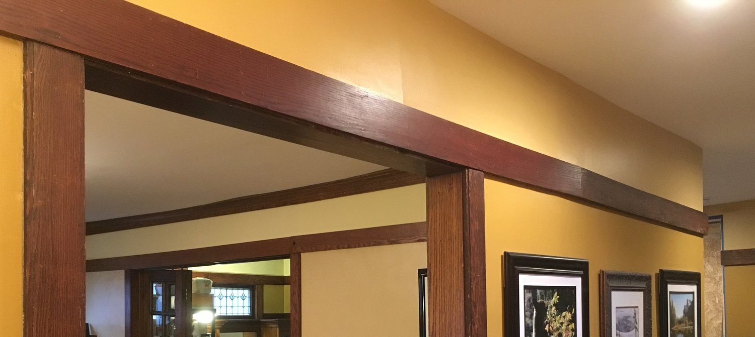
Things went off the rails (pun intended) because of one man: Frank Lloyd Wright. I live in a craftsman home in Oak Park, and like many homes built in the style of Wright, a key architectural detail is a picture rail that runs throughout every room on our first floor.
Image

Picture rail in every room

This picture rail serves as the header for our doorways and windows, and we decided to maintain the rail throughout the new kitchen.

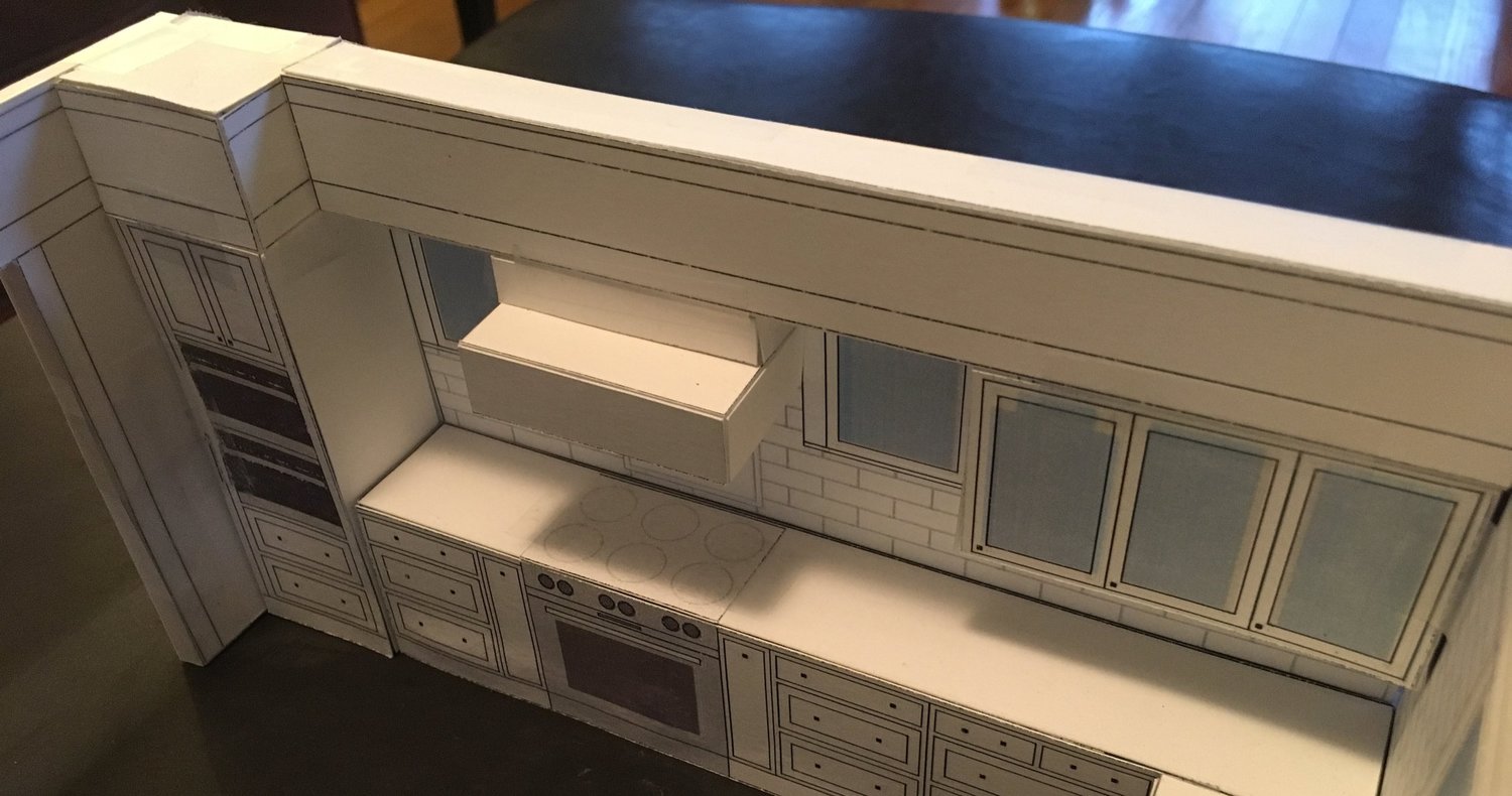
To do so, we needed to have the cabinets stop at the picture rail, and we needed a soffit between the top of the picture rail and the ceiling. The problem - one of the kitchen walls had five different wall elements with different depths: a 24” deep wall oven cabinet, two windows that would be flush against the wall, a 24” deep range hood, and a 13” upper wall cabinets. The question was how to soffit this space.

To solve the problem, I first hand sketched all the possible soffit configurations. Then, I drew them up to scale in Photoshop, and I even dabbled with a 3D CAD tool.

Sketching the possibilities on paper and digitally helped me understand how the different solutions would look, but I still didn’t know how the different options would make me feel.

Since the scaled drawings of the kitchen didn’t answer my question, there was only one natural next step…

The power of prototyping

At work, I spend most of my time prototyping design solutions. I create hand sketches early in the product lifecycle, wireframes when defining workflows, and even full visual mockups. I often create clickable prototypes simulate the user experience. They are used to both validate design hypotheses with end users and to illustrate the experience to stakeholders.

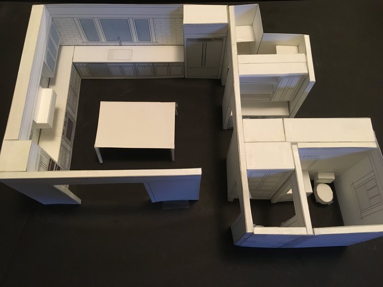
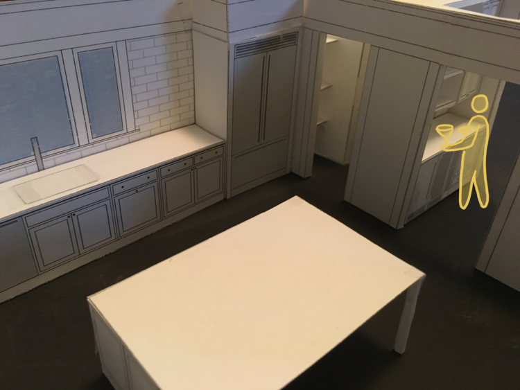
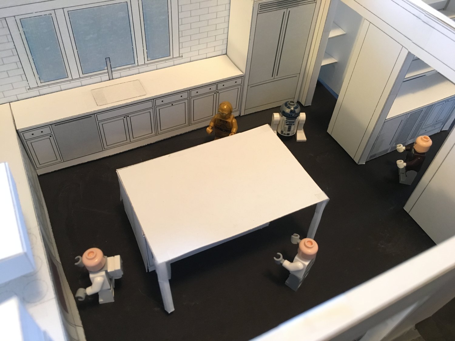
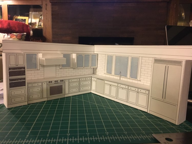
All that said, it wasn’t a tremendous stretch for me to build out a scaled diorama of my kitchen. Card stock, an X-Acto knife, cutting mat, ruler, and lots of tape… a refreshing break from the mouse and keyboard!
Image
Image
Image
Image
The diorama was exactly what I needed to help me understand how I would feel in the space. After popping in different options, Ted and I settled on a two-depth soffit solution, meaning the soffit would sit flush above the cabinets and hood. This felt right, in large part because this solution best maintained the integrity of a Craftsman home.
Image

Two-depth soffit solution

This exercise is similar to what we do at Traceable Change – we simulate the human experience, and that is POWERFUL. Not surprisingly, the kitchen prototype proved to be beneficial for other design decisions as well…

Form vs. function and considering the user

The best home solutions provide an elegant design (form) while also considering how the product will be used (function). Take cabinets. Drawers are becoming extremely popular for lower cabinets because they eliminate the process of opening a door, crouching down, and reaching arm-length deep into a cabinet.

Two changes made to my kitchen design further illustrate the common form vs. function decisions that arise when designing human experiences.

The double oven dilemma

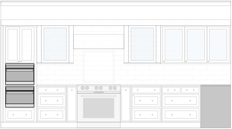
In positioning our double ovens, Lee Ann used the countertop as a dividing line. This created a clean line across the entire wall. In my research, however, I read many negative reviews about the ergonomics of having an oven below the counter. Many complained about always having to crouch down: to use the controls, to view the food while cooking, and to take the food out of the oven.

Image

Original position of the wall ovens

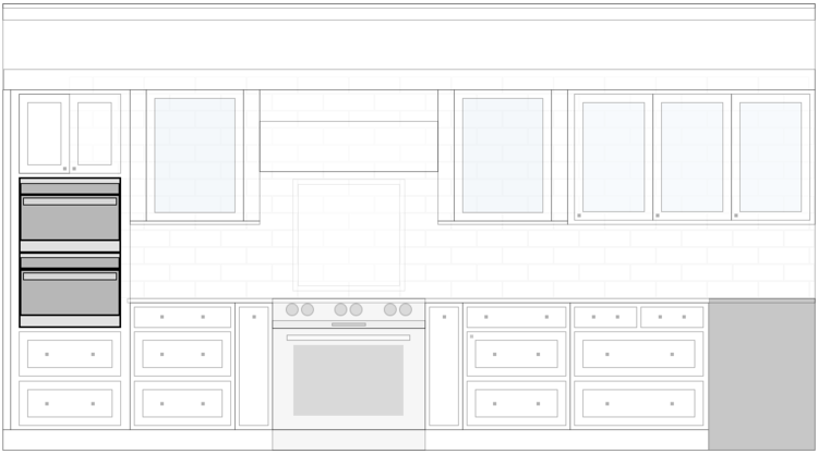
Time to prototype! First, I pushed the ovens up so that the lower oven’s bottom was now in line with the bottom of the top drawer. Then I made a cardboard cutout of the oven door and taped it to its new height, perpendicular to the wall. This allowed me to simulate the open position of the oven door and to evaluate the comfort of putting in and taking out food. All checked out, so we decided to move the ovens higher on the cabinet wall.

Image

Higher positioning of the wall ovens

A window for my wife

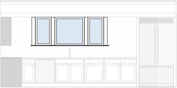
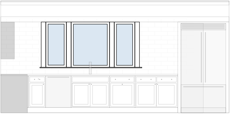
Another form vs. function decision centered around the window above the kitchen sink. Originally, the window was aligned with the upper cabinets, to create a clean aesthetic. While I liked the design, I wondered how this window would function for my wife, who is 5’2”.

Image

Original height of the window

Another form vs. function decision centered around the window above the kitchen sink. Originally, the window was aligned with the upper cabinets, to create a clean aesthetic. While I liked the design, I wondered how this window would function for my wife, who is 5’2”.
Image

Original height of the window

Time to prototype! I drew a 5’2” person into the design and saw that the bottom of the window would fall at her chin line, meaning she would have to be on tiptoe to look out the window. To improve her experience, we lowered the window without sacrificing form. The new window line created a more dramatic impact of the window relative to the space.

Image

Taller height of the window

A social aspect of design

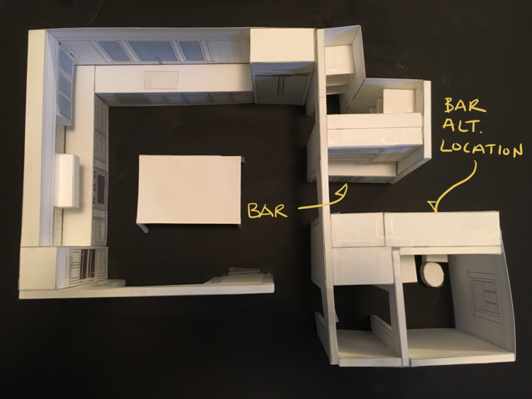
I am a cocktail enthusiast, so naturally, my kitchen plans include a bar area. Because design often involves compromise, the bar ended up in the periphery of the kitchen.

Both Ted and Lee Ann proposed an option to position the bar on the opposite side of the room, in part to allow for a bigger bar and in part because of the position of the water lines. However, the social aspect of the bar placement trumped both my desire for a bigger bar and added plumbing costs.

Image

Position of my bar

When thinking about making cocktails for a roomful of friends, I knew I wanted to be visible and easily accessible. As a sufferer of FOMO, I didn’t want to leave the party every time I had to mix an Old Fashioned. This decision highlighted the extremely social nature of kitchens and the importance of considering both the physical and social aspects of experience in home remodeling.
Maintaining social contact while mixing cocktails

Maintaining social contact while mixing cocktails

When thinking about making cocktails for a roomful of friends, I knew I wanted to be visible and easily accessible. As a sufferer of FOMO, I didn’t want to leave the party every time I had to mix an Old Fashioned. This decision highlighted the extremely social nature of kitchens and the importance of considering both the physical and social aspects of experience in home remodeling.
Image

Maintaining social contact while mixing cocktails

The iterative and collaborative process of design

When sharing this story with friends, people often ask, “Wait, so you have both an architect and a kitchen designer?” and my response is, “Absolutely!” Iterative design and high levels of collaboration are hallmarks of how we design experiences for our clients, and my kitchen remodel was a perfect fit for this process. While I realize this process was atypical, just like a business approaches the design of products and services, my goal was to iterate prior to the swing of a hammer. Had I made changes during the buildout, the cost would have skyrocketed. More importantly, while Ted and Lee Ann individually contributed to aspects of my kitchen design, I believe the final design is much stronger because of our collaboration and iterations.

The last three months have been a great reminder of how the design of human experiences, whether digital, physical, or social, can benefit from UX design and thinking. I can’t wait for the final product in another three (probably four) months!
Image

Yes, these are my son's Lego Star Wars figures... next time, I totally plan to create scaled versions of people!

Sharing is caring!